
background
background
/* 规定要使用的背景颜色。无论是单背景图还是多背景图,背景色一定是在最底下的位置 */
background-color: transparent;
/* 规定背景图像的位置 */
background-position: 0% 0%;
/* 规定背景图片的尺寸 */
background-size: auto auto;
/* 规定如何重复背景图像  */
/* repeat : 默认。背景图像将在垂直方向和水平方向重复 */
/* repeat-x : 背景图像将在水平方向重复 */
/* repeat-y : 背景图像将在垂直方向重复 */
/* no-repeat : 背景图像将仅显示一次 */
background-repeat: repeat;
/* 规定背景图片的定位区域 */
background-origin: padding-box;
/* 规定背景的绘制区域 */
background-clip: border-box;
/* 规定背景图像是否固定或者随着页面的其余部分滚动 */
/* scroll : 默认值,背景相对于元素本身固定,而不是随着它的内容滚动(对元素边框是有效的) */
/* fixed : 背景相对于视口固定。即使一个元素拥有滚动机制,背景也不会随着元素的内容滚动 */
background-attachment: scroll;
/* 规定要使用的背景图像  */
background-image: none;
Q:隐藏元素的background-image 到底加不加载?
A:
- 一个元素,如果
display计算值为none。Firefox 浏览器不会发送图片请求,Chrome 和 Safari 浏览器去加载。- 如果是一个元素的父元素的
display计算值为none,则背景图不会请求,此时浏览器或许放心地认为这个背景图暂时是不会使用的。
linear-gradient
渐变的角度
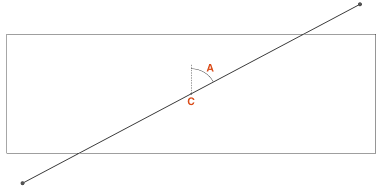
渐变角度: C 点渐变容器中心点,A 是通过 C 点垂直线与通过 C 点渐变线的夹角,该夹角角称为渐变角度。可以使用以下方式定义角度:
- 使用关键词:
to top(对应0deg)、to bottom(对应180deg或者0.5turn)、to left、to right、to top right、to top left、to bottom right和to bottom left。使用关键词时,渐变线首先通过元素中心点并且与顶点垂直相交,与中心点垂直线构成的夹角才是渐变角度。 - 使用带单位数字定义角度,比如
45deg、1turn等
如果省略角度值的设置,那默认是 to bottom(对应 180deg 或者 0.5turn)
<template>
  <div class="linear-gradient-wrapper">
    <div v-for="item in keywordList" :key="item" class="linear-gradient-container">
      <div class="linear-gradient-box" :style="linearGradientKeywordStyle(item)"></div>
      <div class="linear-gradient-desc">linear-gradient({{item}}, red, blue)</div>
    </div>
  </div>
</template>

<script>
export default {
  setup() {
    const keywordList = ['to top', 'to right', 'to bottom', 'to left', 'to top right', 'to top left', 'to bottom right', 'to bottom left']
    const linearGradientKeywordStyle = (angle) => {
      return {
        background: `linear-gradient(${angle}, red, blue)`
      };
    }

    return { keywordList, linearGradientKeywordStyle  }
  }
}
</script>

<style>
.linear-gradient-wrapper {
  display: flex;
  flex-wrap: wrap;
  margin-right: -10px;
}

.linear-gradient-container {
  width: 220px;
  margin-right: 10px;
  margin-bottom: 10px;
  display: flex;
  flex-direction: column;
  align-items: center;
}

.linear-gradient-box {
  width: 200px;
  height: 100px;
}

.linear-gradient-desc {
  font-size: 14px;
}
</style>
<template>
  <div class="linear-gradient-wrapper">
    <div v-for="item in angleList" :key="item" class="linear-gradient-container">
      <div class="linear-gradient-box" :style="linearGradientAngleStyle(item)"></div>
      <div class="linear-gradient-desc">linear-gradient({{item}}deg, red, blue)</div>
    </div>
  </div>
</template>

<script>
export default {
  setup() {
    const angleList = [0, 40, 80, 90, 110, 140, 180, 240, 270, 290, 300, 340, 360]
    const linearGradientAngleStyle = (angle) => {
      return {
        background: `linear-gradient(${angle}deg, red, blue)`
      };
    }
    return { angleList, linearGradientAngleStyle }
  }
}
</script>

<style>
.linear-gradient-wrapper {
  display: flex;
  flex-wrap: wrap;
  margin-right: -10px;
}

.linear-gradient-container {
  width: 220px;
  margin-right: 10px;
  margin-bottom: 10px;
  display: flex;
  flex-direction: column;
  align-items: center;
}

.linear-gradient-box {
  width: 200px;
  height: 100px;
}

.linear-gradient-desc {
  font-size: 14px;
}
</style>
渐变节点
渐变色节点(Color stops)用于指定渐变的起止颜色。
没有显式指定颜色在渐变线上的位置。将沿着渐变线平均分布渐变颜色。
- 如果有两个颜色,颜色1将被放置在渐变线 0% 位置(渐变线开始位置),颜色2将被放置在 100% 位置处(渐变线的结束点)。
- 如果有三个颜色,那么颜色1在渐变线的 0%,颜色2在渐变线的 50%,颜色3在渐变线的 100%。
- 如果有五个颜色,那么它们的位置分别在 0%、25%、50%、75% 和 100%。
在渐变线上显式自定义渐变颜色在渐变线的位置。每个位置可以用百分比表示(相对于渐变线计算),也可以是任何一个CSS长度单位。
如果有一个颜色没有明确的指定其在渐变线上的位置,浏览器会自动计算出其位置。它可以根据第一个位置和下一个位置很容易计算出来。
如果有多个颜色没有指定位置,或者前一个或后一个都没有指定位置。示例如下:
没有超出范围:
linear-gradient(100deg, red, orange, yellow 30%, red, black)linear-gradient - 渐变节点 - 没有超出范围<div class="linear-gradient"></div>.linear-gradient { width: 200px; height: 100px; background: linear-gradient(100deg, red, orange, yellow 30%, red, black); }只有第三个颜色 yellow 指定了位置,在渐变线的 30% 处。为了很好的分发,它把第一个颜色 red 放置在渐变线的 0% 处,最后一个颜色 black 放置在渐变线的 100% 处。第二个颜色 orange 放置在渐变线 0% 至 30% 的中间位置,第四个颜色 red 放置在渐变线 30% 至 100% 中间位置。
超出范围:
linear-gradient(100deg, red, orange, yellow, red, black 120%)linear-gradient - 渐变节点 - 超出范围<div class="linear-gradient"></div>.linear-gradient { width: 200px; height: 100px; background: linear-gradient(100deg, red, orange, yellow, red, black 120%); }最后一个颜色是在渐变线的 120% 位置处,因此其他颜色也将根据这个位置平均分布(默认的起始位置仍然是 0%)
未按照顺序设置渐变节点:
linear-gradient(100deg, red 30%, orange 10%, yellow 60%, blue 40%)linear-gradient - 渐变节点 - 未按照顺序设置渐变节点<div class="linear-gradient"></div>.linear-gradient { width: 200px; height: 100px; background: linear-gradient(100deg, red 30%, orange 10%, yellow 60%, blue 40%); }颜色点位置是按照预计的指令操作,并不会阻止不按其位置顺序来操作。但如果后面的值比前面的值更小时,浏览器会自动做相应的纠正处理。
从第一个颜色 red 开始,其定位在渐变线的 30% 位置处,第二个颜色 orange 在 10% 位置,但这是错误的,正如上面所说的,颜色的停止点是一个增量。这个时候,浏览器将会纠正第二个颜色的位置,它将会和前一个颜色的位置一样,也分布在渐变线的 30% 位置。然后第三个颜色 yellow 分布在渐变线的 60% 位置处,但紧随其后的第四个颜色 blue 为 40%,浏览器同样会纠正并设置其位置与前一个颜色位置相同。
颜色不见了的情况:
linear-gradient(100deg, red 30%, orange, yellow, blue 10%)linear-gradient - 渐变节点 - 颜色不见了的情况<div class="linear-gradient"></div>.linear-gradient { width: 200px; height: 100px; background: linear-gradient(100deg, red 30%, orange, yellow, blue 10%); }最后一个颜色 blue 是不正确的位置,因此浏览器将会纠正它的位置与之前的位置相同,在这种情况之下并不是与其相邻的颜色 yellow,也不会是 orange,它会追溯到第一个颜色 red 位置处。因此,red 和 blue 都分布在渐变线的 30% 处,因此其中 yellow 和 orange 两颜色都将不可见。
conic-gradient
linear-gradient:线型渐变。渐变的方向是一条直线,可以是任何角度。radial-gradient:径向渐变。从圆心点以椭圆形状向外扩散。conic-gradient:锥形渐变。从圆心点以圆锥状向外扩散,以顺时针方向绕中心实现渐变效果。repeating-conic-gradient:创建重复的锥形渐变来填充 360 度旋转。
<div class="color-dial-container">
  <div class="color-dial-hex-box">
    <div class="color-dial-rgb"></div>
    <div class="color-dial-desc">使用 rgb</div>
  </div>
  <div>
    <div class="color-dial-hsl"></div>
    <div class="color-dial-desc">使用 hsl</div>
  </div>
</div>
.color-dial-container {
display: flex;
}
.color-dial-desc {
text-align: center;
}
/* 使用 `rgb()` 表示颜色盘,颜色不够丰富不够明亮,起始处与结尾处衔接不够自然 */
.color-dial-rgb {
margin-right: 20px;
width: 200px;
height: 200px;
border-radius: 50%;
background: conic-gradient(red, orange, yellow, green, teal, blue, purple);
}
/* 使用 `hsl()` (色相-饱和度-明度(Hue-saturation-lightness))
- 色相(H):色彩的基本属性,就是平常所说的颜色名称,如红色、黄色等。
- 饱和度(S):指色彩的纯度,越高色彩越纯,低则逐渐变灰,取 0-100% 的数值。
- 明度(V),亮度(L):取 0-100% 的数值。 */
.color-dial-hsl {
width: 200px;
height: 200px;
/* 通过改变色相得到一个较为明亮完整的颜色色系。也就是采用这样一个过渡 hsl(0%, 100%, 50%) –> hsl(100%, 100%, 50%),中间只改变色相,生成 20 个过渡状态。 */
background: conic-gradient(red, #ff4d00, #f90, #ffe600, #cf0, #80ff00, #3f0, #00ff1a, #0f6, #00ffb3, cyan, #00b3ff, #06f, #0019ff, #30f, #8000ff, #c0f, #ff00e6, #f09, #ff004c, red);
border-radius: 50%;
}
/* 使用 scss 实现 */
/* $colors: ();
$totalStops: 20;
@for $i from 0 through $totalStops {
$colors: append($colors, hsl($i * (360deg / $totalStops), 100%, 50%), comma);
}
.color-dial-hsl {
width: 200px;
height: 200px;
background: conic-gradient($colors);
border-radius: 50%;
} */<div class="pie-chart"></div>.pie-chart {
width: 200px;
height: 200px;
background: conic-gradient(deeppink 0, deeppink 30%, yellowgreen 30%, yellowgreen 70%, teal 70%, teal 100%);
border-radius: 50%;
}<div class="conic-gradient-container">
<div class="conic-gradient"></div>
<div class="repeating-conic-gradient"></div>
</div>.conic-gradient-container {
display: flex;
}
.conic-gradient {
margin-right: 20px;
width: 200px;
height: 200px;
background: conic-gradient(deeppink 0 15deg, yellowgreen 0 30deg);
border: 1px solid #000;
}
.repeating-conic-gradient {
width: 200px;
height: 200px;
background: repeating-conic-gradient(deeppink 0 15deg, yellowgreen 0 30deg);
border: 1px solid #000;
}<div class="random-conic-gradient"></div>/* 使用 scss 随机生成一个多颜色的圆锥渐变图案 */
/* @function randomNum($max, $min: 0, $u: 1) {
@return ($min + random($max)) * $u;
}
@function randomConicGradient() {
$n: random(30) + 10;
$list: ();
@for $i from 0 to $n {
$list: $list, rgb(randomNum(255), randomNum(255), randomNum(255));
}
@return conic-gradient($list, nth($list, 1));
} */
.random-conic-gradient {
width: 200px;
height: 200px;
/* background: randomConicGradient(); */
background: conic-gradient( #147b68, #3f246c, #6da5e9, #e95569, #0de2b4, #828894, #4f9c5a, #5949de, #bd1440, #f4e8a2, #9e4c46, #6ef880, #414a36, #f3eba7, #52ab92, #d8493c, #b9d93d, #73ce54, #147b68, #3f246c, #6da5e9, #e95569, #0de2b4, #828894, #4f9c5a, #5949de, #bd1440, #f4e8a2, #9e4c46, #6ef880, #414a36, #f3eba7, #52ab92, #d8493c, #b9d93d);
}<div class="dashboard-bg">
<div class="dashboard-point"></div>
</div>.dashboard-bg {
position: relative;
margin: 10px auto;
width: 400px;
height: 400px;
border-radius: 50%;
background: conic-gradient(#f1462c 0%, #fc5d2c 12.4%, #fff 12.5%, #fff 12.5%, #fc5d2c 12.5%, #fba73e 24.9%, #fff 24.9%, #fff 25%, #fba73e 25%, #e0fa4e 37.4%, #fff 37.4%, #fff 37.5%, #e0fa4e 37.5%, #12dd7e 49.9%, #fff 49.9%, #fff 50%, #12dd7e 50%, #0a6e3f 62.4%, #fff 62.4%, #fff 62.5%);
transform: rotate(-112.5deg);
transform-origin: 50% 50%;
}
.dashboard-bg::before {
content: "";
position: absolute;
top: 50%;
left: 50%;
transform: translate(-50%, -50%);
width: 370px;
height: 370px;
border-radius: 50%;
background: #fff;
}
.dashboard-bg::after {
content: "";
position: absolute;
top: 50%;
left: 50%;
transform: translate(-50%, -50%);
width: 320px;
height: 320px;
border-radius: 50%;
background:
radial-gradient(#fff 0%, #fff 25%, transparent 25%, transparent 100%),
conic-gradient(#f1462c 0 12.5%, #fba73e 0 25%, #e0fa4e 0 37.5%, #12dd7e 0 50%, #0a6e3f 0 62.5%, #fff 0 100%);
}
.dashboard-point {
position: absolute;
width: 30px;
height: 30px;
transform: translate(-50%, -50%);
left: 50%;
top: 50%;
background: radial-gradient(#467dc6 0%, #a4c6f3 100%);
border-radius: 50%;
z-index: 999;
}
.dashboard-point::before {
content: "";
position: absolute;
width: 5px;
height: 350px;
left: 50%;
top: 50%;
transform: translate(-50%, -50%) rotate(0);
border-radius: 100% 100% 5% 5%;
background: linear-gradient(
180deg,
#9bc7f6 0,
#467dc6 50%,
transparent 50%,
transparent 100%);
animation: rotate 3s cubic-bezier(.93, 1.32, .89, 1.15) infinite;
}
@keyframes rotate {
50% {
transform: translate(-50%, -50%) rotate(150deg);
}
100% {
transform: translate(-50%, -50%) rotate(150deg);
}
}多背景叠加
.multi-bg {
  /* 用于不识别多重背景的默认背景图片 */
  background:url(demo.gif) no-repeat;
  /* 多重背景,第一个背景在最上面 */
  background:
    url(demo.gif) no-repeat,
    url(demo1.gif) no-repeat left bottom,
    url(demo2.gif) no-repeat 10px 15px;
  /* 定义的默认背景颜色 */
  background-color:yellow;
}
雪碧图
网站开发 90% 会用到小图标,多小图标调用显示是前端开发常见的问题。目前小图标显示常见有两种方式:
图标字体显示
CSS Sprite (CSS 精灵), 也称作雪碧图(CSS图像合成技术)
CSS 雪碧图应用原理:截取大图一部分显示,而这部分就是一个小图标。
.sprite {
  background-image: url("sprite.png");
  background-position: -60px 0px;
  width:48px;
  height:48px;
}
Q:为什么使用雪碧图时
background-position属性值为负数 ?A:
span标签是一个 25px 长宽的容器,在使用背景图时,背景图的初始位置会从容器的左上角的开始铺满整个容器,然而容器的大小限制了背景图呈现的大小,超出容器部分被隐藏起来。 假如设置background-position: 0 0;那么意味着,背景图相对于容器(span标签)x轴 = 0;y轴=0位置作为背景图的起始位置来显示图片。所以,如果需要在容器中显示第二个图标,意味着雪碧图 x 轴方向要左移动,左移动雪碧图即它的值会设置为负数,同理y轴方向也一样。
Base64
Base64 是一组相似的二进制到文本(binary-to-text)的编码规则,让二进制数据在解释成 64 进制的表现形式后能够用 ASCII 字符串的格式表示出来。Base64 这个词出自一种特定的 MIME 内容传输编码。
使用 Base64 编码代替 CSS 背景图片是有局限性的,并不是所有图片都适合使用 Base64 编码这种技术的。例如:
- CSS Sprite 图片后期维护难,只能是独立图片
- 图片尺寸过大,CSS 文件变得臃肿,反而不利于加载
- CSS 文件的优点就是重用,因此,如果背景图片就一个地方使用,减少的请求数有限,考虑到其他成本,还不如直接使用普通url图片地址
- 图片经常改动的话,不利于使用