
Sticky Footer
2020/5/17大约 4 分钟
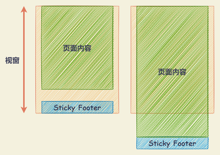
Sticky Footer
- 如果页面内容不足够长时,页脚固定在浏览器窗口的底部。
- 如果页面内容足够长时,页脚固定在页面的最底部。但如果页面内容不够长,置底的页脚就会保持在浏览器窗口底部。
将内容部分的底部外边距设为负数
- 将内容部分最小高度设为 100% (即,
min-height: 100%)。 - 再将内容部分的底部外边距设为负数,与底部内容高度保持一致。当高度不满时,页脚保持在窗口底部,当高度超出则随之推出的效果。
注意:使用该方法需要 容器里有额外的占位元素(如 .push) 。
通过将内容部分的底部外边距设为负数实现 Sticky Footer
<div class="container">
  <div class="wrapper">
    <header class="header">Header</header>
    <div class="content">
      <div>Content</div>
      <div>set content height : <input class="content-input" type="text" /> px</div>
    </div>
    <div class="push"></div>
  </div>
  <footer class="footer">Sticky Footer</footer>
</div>
/* 模拟 html、body 的高度 */
.container {
--var-content-height: 100px;
height: 300px;
margin: 0;
overflow: auto;
font-size: 20px;
font-weight: bold;
}
.wrapper {
min-height: 100%;
/* 等于 footer 的高度 */
margin-bottom: -50px;
background-color: #818c94;
}
.header {
height: 50px;
background-color: #db6f53;
}
.content {
height: var(--var-content-height);
background-color: #59a7d1;
}
.push {
height: 50px;
background-color:rgba(62, 175, 124, 0.5);
}
.footer {
height: 50px;
display: flex;
justify-content: center;
align-items: center;
background-color: #3eaf7c;
}const containerDOM = document.querySelector('.container');
const contentInputDOM = document.querySelector('.content-input');
contentInputDOM.addEventListener('input', (event) => {
const val = event.target.value
containerDOM.style.setProperty("--var-content-height", val + 'px')
})将页脚的顶部外边距设为负数
给内容外增加父元素,并让内容部分的底部内边距与页脚高度的值相等。
通过将页脚的顶部外边距设为负数实现 Sticky Footer
<div class="container">
  <div class="wrapper">
    <header class="header">Header</header>
    <div class="content">
      <div>Content</div>
      <div>set content height : <input class="content-input" type="text" /> px</div>
    </div>
    <div class="push"></div>
  </div>
  <footer class="footer">Sticky Footer</footer>
</div>
/* 模拟 html、body 的高度 */
.container {
--var-content-height: 100px;
height: 300px;
margin: 0;
overflow: auto;
font-size: 20px;
font-weight: bold;
}
.wrapper {
min-height: 100%;
background-color: #818c94;
}
.header {
height: 50px;
background-color: #db6f53;
}
.content {
height: var(--var-content-height);
background-color: #59a7d1;
}
.push {
height: 50px;
background-color:rgba(62, 175, 124, 0.5);
}
.footer {
height: 50px;
margin-top: -50px;
display: flex;
justify-content: center;
align-items: center;
background-color: #3eaf7c;
}const containerDOM = document.querySelector('.container');
const contentInputDOM = document.querySelector('.content-input');
contentInputDOM.addEventListener('input', (event) => {
const val = event.target.value
containerDOM.style.setProperty("--var-content-height", val + 'px')
})Flex 布局
通过 Flex 实现 Sticky Footer
<div class="container">
  <div class="wrapper">
    <header class="header">Header</header>
    <div class="content">
      <div>Content</div>
      <div>set content fill height : <input class="content-input" type="text" /> px</div>
      <div class="content-fill-height">fill-fill-height-block</div>
    </div>
    <footer class="footer">Sticky Footer</footer>
  </div>
</div>
/* 模拟 html、body 的高度 */
.container {
--var-fill-content-height: 100px;
height: 300px;
margin: 0;
overflow: auto;
font-size: 20px;
font-weight: bold;
}
.wrapper {
min-height: 100%;
display: flex;
flex-direction: column;
background-color: #818c94;
}
.header {
height: 50px;
background-color: #db6f53;
}
.content {
flex: 1;
background-color: #59a7d1;
}
.content-fill-height {
height: var(--var-fill-content-height);
background-color:rgba(129, 140, 148, 0.5);
}
.footer {
height: 50px;
display: flex;
justify-content: center;
align-items: center;
background-color: #3eaf7c;
}const containerDOM = document.querySelector('.container');
const contentInputDOM = document.querySelector('.content-input');
contentInputDOM.addEventListener('input', (event) => {
const val = event.target.value
containerDOM.style.setProperty("--var-fill-content-height", val + 'px')
})Grid 布局
通过 Grid 实现 Sticky Footer
<div class="container">
  <div class="wrapper">
    <header class="header">Header</header>
    <div class="content">
      <div>Content</div>
      <div>set content fill height : <input class="content-input" type="text" /> px</div>
      <div class="content-fill-height">fill-height-block</div>
    </div>
    <footer class="footer">Sticky Footer</footer>
  </div>
</div>
/* 模拟 html、body 的高度 */
.container {
--var-fill-content-height: 100px;
height: 300px;
margin: 0;
overflow: auto;
font-size: 20px;
font-weight: bold;
}
.wrapper {
min-height: 100%;
display: grid;
grid-template-rows: auto 1fr auto;
background-color: #818c94;
}
.header {
height: 50px;
background-color: #db6f53;
}
.content {
background-color: #59a7d1;
}
.content-fill-height {
height: var(--var-fill-content-height);
background-color:rgba(129, 140, 148, 0.5);
}
.footer {
grid-row-start: 3;
grid-row-end: 4;
height: 50px;
display: flex;
justify-content: center;
align-items: center;
background-color: #3eaf7c;
}const containerDOM = document.querySelector('.container');
const contentInputDOM = document.querySelector('.content-input');
contentInputDOM.addEventListener('input', (event) => {
const val = event.target.value
containerDOM.style.setProperty("--var-fill-content-height", val + 'px')
})absolute
通过将内容部分的底部外边距设为负数实现 Sticky Footer
<div class="container">
  <div class="wrapper">
    <header class="header">Header</header>
    <div class="content">
      <div>Content</div>
      <div>set content height : <input class="content-input" type="text" /> px</div>
    </div>
    <footer class="footer">Sticky Footer</footer>
  </div>
</div>
/* 需指定 `html`、`body` `100%` 的高度 */
/* 且 `content` 的 `padding-bottom` 需要与 `footer` 的 `height` 一致 */
/* 模拟 html、body 的高度 */
.container {
--var-content-height: 100px;
height: 300px;
margin: 0;
overflow: auto;
font-size: 20px;
font-weight: bold;
}
.wrapper {
position: relative;
min-height: 100%;
padding-bottom: 50px;
box-sizing: border-box;
background-color: #818c94;
}
.header {
height: 50px;
background-color: #db6f53;
}
.content {
height: var(--var-content-height);
background-color: #59a7d1;
}
.footer {
position: absolute;
left: 0;
right: 0;
bottom: 0;
height: 50px;
display: flex;
justify-content: center;
align-items: center;
background-color: #3eaf7c;
}const containerDOM = document.querySelector('.container');
const contentInputDOM = document.querySelector('.content-input');
contentInputDOM.addEventListener('input', (event) => {
const val = event.target.value
containerDOM.style.setProperty("--var-content-height", val + 'px')
})calc
通过计算函数 calc 计算(视窗高度 - 页脚高度)赋予内容区最小高度,不需要任何额外样式处理,代码量最少、最简单。
<div class="wrapper">
  <div class="content">
    <!-- 页面主体内容区域 -->
  </div>
  <div class="footer">
    <!-- 需要做到 Sticky Footer 效果的页脚 -->
  </div>
</div>

<style>
.content {
  min-height: calc(100vh - 50px);
}

.footer {
  height: 50px;
}
</style>
footer 的高度值需要与 content 其中的计算值一致。